

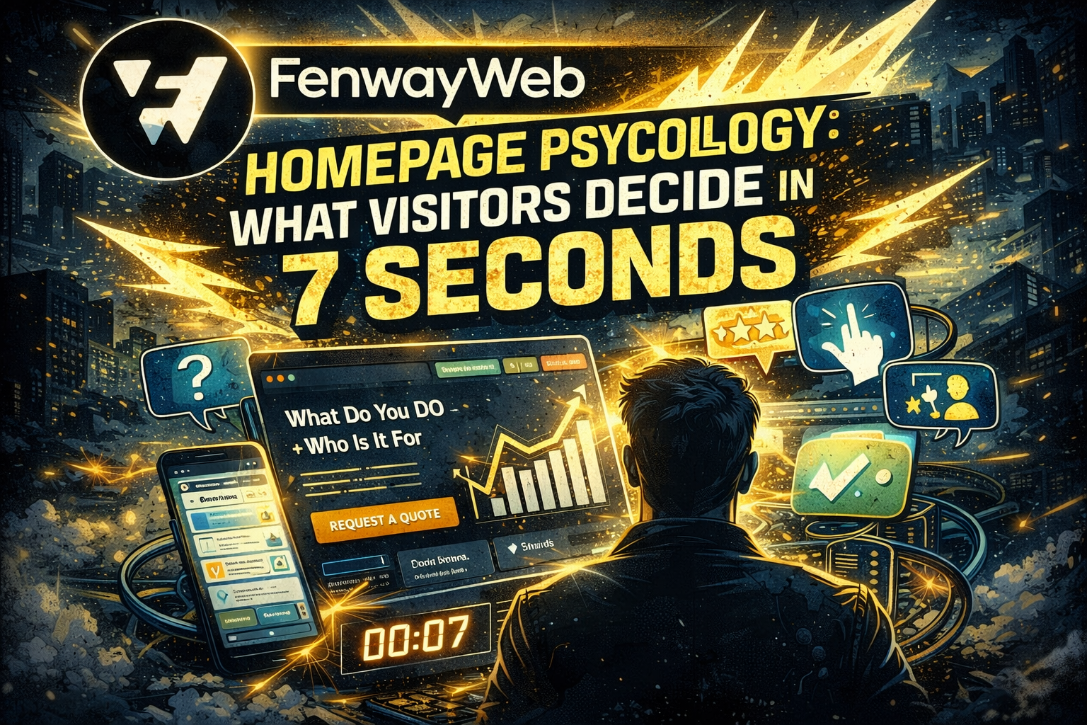
Homepage Psychology: What Visitors Decide in 7 Seconds
Boston Made, Inc.Office of the Founder & CEO
From the desk of Nathan StricklandBoston, Massachusetts ·
Dear Sir or Madam,
How to design your homepage like a conversion machine — not a brochure.
You don’t get minutes to make an impression anymore.
You get seconds.
In today’s internet, your homepage isn’t competing against other websites — it’s competing against:
- distractions
- short attention spans
- skepticism
- “I’ll deal with this later”
- and a visitor who clicked your link while doing 7 other things
That’s why the homepage is no longer “just the front of your website.”
It’s the decision point.
And the cold truth is this:
Most visitors decide what they think about your business within 7 seconds.
Not because they’re rude.
Because they’re overloaded.
The average visitor lands on a homepage with one silent question:
“Is this for me… and can I trust this?”
If your homepage answers that fast, you win.
If it doesn’t, they’re gone — and you often never get another chance.
At Fenway Web, we treat the homepage like the engine room of a brand’s digital presence. Because if the homepage is weak, it doesn’t matter how great the rest of the website is.
So let’s break down what’s really happening in those first 7 seconds… and how to build a homepage that holds attention, builds trust, and drives action.
Why the Homepage Is the Hardest Page to Build
People often assume the homepage is the easiest.
It’s not.
The homepage must do a ridiculous amount of work in a short amount of space:
- explain what you do
- prove credibility
- showcase services
- make it easy to navigate
- speak to multiple customer types
- handle mobile visitors perfectly
- feel branded and professional
- push someone to take a next step
In other words, the homepage is not “one page.”
It’s your business model — condensed.
That’s why generic templates fail.
A homepage is psychology.
Not just design.
The 7-Second Audit: What People Instantly Notice
Whether they realize it or not, visitors judge your homepage based on a few rapid-fire signals:
1) Clarity
Do I understand what this company does?
2) Credibility
Do they look legit?
3) Confidence
Do they seem like professionals?
4) Convenience
Can I find what I need quickly?
5) Next Step
Do I know what to do now?
If any of those are missing, the visitor mentally says:
“Nah… I’m not doing homework today.”
And they bounce.
The Biggest Mistake Businesses Make: They Write For Themselves
Here’s what most homepages do wrong.
They use copy that sounds like:
- “Welcome to our website”
- “We provide high-quality solutions”
- “Customer satisfaction is our priority”
- “Serving the community since…”
None of that is bad — it’s just not persuasive.
Because the visitor doesn’t care about your history yet.
They care about:
- their problem
- their pain
- their risk
- their time
- their money
A strong homepage speaks to the visitor’s world first.
Then introduces the company.
The Homepage Formula Fenway Web Builds Around
At Fenway Web, when we build a homepage, we follow a conversion-first framework.
A homepage must achieve three things in the first screen:
✅ 1) Tell them what you do
✅ 2) Tell them who it’s for
✅ 3) Tell them what to do next
If your first section doesn’t do that, the visitor gets confused.
And confusion kills conversion.
Section 1: The Hero Area (Where Most Websites Lose)
The hero section is the top portion of your homepage.
It’s the most important real estate on your entire website.
And most companies waste it with:
- a skyline photo
- a vague slogan
- a big logo
- an image slider (please no)
- a paragraph no one reads
A high-performance hero section needs:
✅ A clear headline
A real one. Not clever. Not vague.
Examples of clarity headlines:
- “Custom WordPress Websites Built to Convert”
- “Local SEO + Website Systems for Service Businesses”
- “High-Performance Websites for Brands Ready to Scale”
✅ A supporting subheadline
This explains the benefit:
- what makes you different
- how you solve it
- what the outcome is
✅ A primary call-to-action button
One button.
Not five.
Examples:
- “Request a Quote”
- “Book a Consultation”
- “See Our Work”
✅ A trust signal
This could be:
- 5-star reviews count
- “Trusted by ___ businesses”
- awards, certifications
- mention of results (“500+ leads generated” etc.)
The #1 Rule of a Great Homepage:
People Must Feel Safe
In 2026, customers don’t just buy services.
They buy certainty.
They are trying to avoid:
- scams
- flaky contractors
- low-quality work
- wasted money
- bad communication
- excuses
Your homepage must feel like the most stable thing they’ve seen all day.
That means your design needs:
- consistent spacing
- clean typography
- professional images
- strong contrast
- organized sections
- no clutter
- no chaos
A homepage is a trust environment.
Section 2: Proof Before Detail
A huge mistake is to jump into services too fast.
Visitors are thinking:
“Why should I believe you can do it?”
So before you explain everything…
you prove something.
That proof can be:
- a portfolio grid
- short case study highlights
- client logos
- real testimonials with names and photos
- before/after examples
Once trust is built, the visitor becomes willing to explore more.
Proof turns browsers into buyers.
Section 3: The Service Block Must Be Organized Like A Menu
A homepage should never list 12 services in random paragraphs.
Visitors don’t read like that.
They scan.
Your service section should function like a menu:
- 3–6 core services
- short description per service
- “Learn more” links to service pages
This does 2 things:
- It gives the visitor a fast understanding
- It strengthens SEO through structured internal linking
Section 4: The “How It Works” Process is Non-Negotiable
One of the most powerful sections on any homepage is:
“Here’s how this works.”
Because people are scared of uncertainty.
They want to know:
- how long does it take?
- what’s the first step?
- what happens after I pay?
- how does this process work?
A clear process lowers anxiety.
It reduces friction.
It increases conversion.
Fenway Web loves a simple process like:
- Discovery Call
- Strategy + Wireframe
- Development + Build
- Launch + Support
Section 5: The Story Block (But It Must Be About The Customer)
Brand story matters — but not as a biography.
A homepage story block isn’t:
“Founded in…”
It’s:
“Why we do this.”
A powerful story shows:
- belief system
- mission
- standards
- obsession with quality
- why you’re different from cheap alternatives
The visitor should think:
“These people care.”
Section 6: The Footer CTA (Where Conversion Happens Quietly)
Even if someone scrolls the whole page…
they still might not act.
So at the bottom, you need a strong closing CTA.
Something that feels final.
Examples:
- “Let’s build your website the right way.”
- “Book a strategy call and let’s map your system.”
- “Ready to stop guessing and start growing?”
Then the button.
Then the contact info.
The Silent Conversion Weapon: Navigation Simplicity
Here’s a big one.
Your menu should never feel like a puzzle.
A simple navigation wins:
- Home
- Services
- Portfolio
- About
- Blog
- Contact
That’s it.
If you have 14 dropdowns, you’re creating confusion.
And confusion kills confidence.
What Fenway Web Builds Homepages To Do
A homepage should do more than look good.
It should function as:
✅ a salesperson
✅ a trust builder
✅ a directory
✅ a funnel
✅ a conversion system
If your homepage is just a “welcome mat,” you’re losing money every day.
Final Thought: Your Homepage Is a First Conversation
Think of your homepage like meeting someone in person.
If they walk up and say:
“I provide high-quality solutions across industries…”
You’d walk away.
But if they say:
“I help businesses grow online with systems that actually convert.”
You’d listen.
That’s what your homepage needs to do.
It should immediately communicate:
- relevance
- trust
- clarity
- next step
Because in 2026, attention is expensive.
And a homepage is either:
- your greatest digital asset
or - your biggest silent leak
Fenway Web builds homepages designed to win those first 7 seconds — and turn them into lasting customers.
Tags:
Brand Trust
Business Websites
conversion optimization
digital branding
Fenway Web
High-Performance Websites
Homepage Design
Lead Generation
Marketing Strategy
Professional Web Design
User Experience
Web Design Strategy
Website Conversions
Website Copywriting
Website CTA
Website Psychology
Website Structure
WordPress Websites


