


The 5-Page Website Framework That Wins Locally
The simplest structure that generates leads, builds trust, and ranks in Google.
Most small businesses overcomplicate their websites.
They think they need:
- 40 pages
- 15 dropdown menus
- 9 different “About” pages
- 12 random service posts
- a blog that isn’t connected to anything
- and a homepage that tries to do everything at once
But the truth is, especially for local businesses, the most effective websites are often the simplest ones — as long as they’re built with structure and intent.
At Fenway Web, we’ve learned something after building and rebuilding websites for real brands:
A local business doesn’t need a complicated website.
It needs a complete website.
And “complete” doesn’t mean more pages.
It means the right pages — built the right way.
This is where the 5-page framework wins.
Because it creates clarity for customers and structure for search engines.
Why Local Business Websites Fail (Even When They Look Good)
This will surprise some people:
A website can look amazing and still lose money.
Why?
Because it fails at one of these:
- It doesn’t answer the visitor quickly
- It doesn’t establish trust
- It doesn’t guide action
- It doesn’t rank for anything
- It doesn’t have enough content depth
- It doesn’t clearly separate services
- It doesn’t create internal linking pathways
In other words, it exists… but it doesn’t perform.
The 5-page framework solves that problem by building the website like a lead-focused system — with the minimum number of pages required to become credible and rankable.
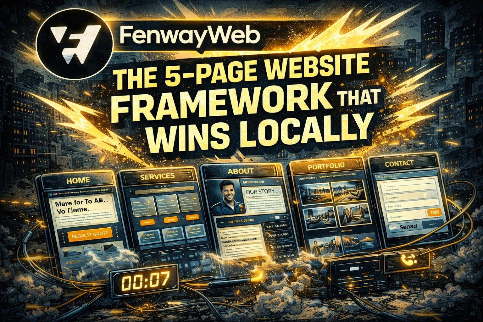
The 5 Pages Every Local Business Website Must Have
Here it is:
- Home
- Services
- About
- Portfolio / Results (Proof)
- Contact
That’s the core.
If you build these five pages correctly, you have what most businesses are missing:
- a real structure
- a clear customer journey
- and a foundation for SEO
Then later, you can expand with:
- service subpages
- location pages
- blog content clusters
- landing pages
But this five-page foundation is the engine.
Let’s break down exactly how each page should be built — Fenway Web style.
Page 1: Home Page
Your digital handshake
Your homepage is not the place to explain everything.
Your homepage is the place to make someone say:
“Yes… this is what I’m looking for.”
✅ Homepage goals:
- clarify what you do
- establish credibility
- show proof quickly
- guide the visitor toward a next step
A Fenway Web homepage includes:
- a clear hero section (what you do + who it’s for + what to do next)
- trust signals (reviews, logos, results, years, licenses)
- services overview (not the full explanation — that’s for the Services page)
- a simple process section (“How it works”)
- proof grid (portfolio/case studies)
- closing CTA with contact info
The homepage is built to convert interest into movement.
Page 2: Services Page
Where ranking and revenue begin
This is where most local businesses mess up.
They list services like a grocery list.
Or worse:
they only mention their services on the homepage and never create a dedicated services section.
Search engines need structure.
Visitors need structure.
And your service offerings need clear separation.
✅ Services page goals:
- explain offerings clearly
- build confidence and authority
- connect each service to a benefit
- set up future service subpages
The Fenway Web approach:
Instead of listing services, we create service blocks.
Each service block includes:
- service title
- 2–4 sentence overview
- who it’s for
- common problems it solves
- internal links to service pages (or future ones)
- CTA button
Even if the business only offers 2–3 services, we still structure them as blocks.
Why?
Because your services page is a ranking asset.
It tells Google:
“These are the categories this business should show up for.”
It tells the customer:
“This company is organized and confident.”
Page 3: About Page
The trust page
People think the About page is optional.
It is not.
The About page is often the second most visited page on a website after Home — especially in local service businesses.
Because people want to know:
“Who am I dealing with?”
✅ About page goals:
- humanize the business
- explain why you do what you do
- show integrity
- build confidence
But here’s the important part:
The About page should not just be a timeline.
It should answer the visitor’s fear.
Because local customers fear:
- unreliability
- scams
- bad work
- poor communication
- being ignored after they pay
Fenway Web structure for About pages:
- strong intro: mission + belief
- founder/team photo (real photo)
- origin story (short and powerful)
- values and standards
- “what makes us different”
- small credibility section (licenses, certifications, experience)
- CTA: “Let’s work together” / “Request a quote”
The About page isn’t about ego.
It’s a trust builder.
Page 4: Portfolio / Results Page
Proof solves doubt
This page is where businesses start separating themselves from competitors.
Because when a visitor sees proof, their mental resistance drops.
Proof creates certainty.
✅ Portfolio page goals:
- prove results
- show real examples
- reduce buyer anxiety
- create conversion momentum
Not every business has obvious “portfolio” items.
So we rename it based on industry:
- “Our Work”
- “Projects”
- “Gallery”
- “Results”
- “Before & After”
- “Case Studies”
What Fenway Web includes on a proof page:
- grid of projects / photos
- short captions explaining the outcome
- industry/service type filters if needed
- testimonials embedded under related work
- “featured project” breakdowns (mini case studies)
- CTA below each section
If you can show:
- photos of work
- specific results
- real client names/testimonials
…you’ll beat most competitors immediately.
Because most competitors only talk.
Proof shows.
Page 5: Contact Page
Don’t make it hard to pay you
This one’s simple, but it’s where many websites still fail.
They treat the contact page like an afterthought.
The contact page should be designed for convenience and urgency.
✅ Contact page goals:
- make it insanely easy to reach you
- reduce friction
- capture the lead cleanly
- reassure the visitor
Fenway Web contact page includes:
- click-to-call number at top
- service area
- contact form (short form wins)
- message expectations: “We respond within 24 hours”
- optional booking calendar
- map embed (if local office)
- FAQ section (quick objections: pricing, coverage, turnaround time)
Contact pages shouldn’t feel like paperwork.
They should feel like:
“You’re 1 step away from solving this problem.”
Why This 5-Page Framework Wins in Google
Google ranks structure.
Not chaos.
A website with the 5-page foundation built correctly provides:
- clean navigation
- internal linking clarity
- strong topical relevance
- dedicated content for core keywords
This creates a launchpad for:
- service subpages (Service Page SEO)
- local pages (Location SEO)
- blog clusters (Content SEO)
- landing pages (Ad SEO)
So even if the business is starting small…
It’s built like it’s going to grow.
That’s the Fenway Web strategy.
Fenway Web: Where Systems Replace Guesswork
This framework is why Fenway Web can consistently deliver results.
Not because of luck.
Not because of trends.
Because structure wins — every time.
Most businesses don’t need 100 pages.
They need a website that feels like:
- professional
- clear
- trustworthy
- easy
- fast
- organized
The 5-page framework creates that.
And once that foundation is built…
Everything else becomes easier:
- SEO becomes predictable
- marketing becomes cheaper
- trust becomes automatic
- leads become consistent
Final Thought: A Website Should Feel Like a Business
If a website feels confusing, messy, or incomplete…
people assume the business is too.
But if a website feels clear, structured, and confident…
people assume the business is too.
That’s why this matters.
Because your website is often the first interaction someone has with your brand.
Fenway Web builds websites with architecture — not guesswork — because we don’t just want you online…
We want you winning.


